Tuesday, December 18, 2012

Toy Story in Windows Movie Maker

Toy Story with Windows Movie Maker

Students Use Writing and Photography to Create an Original Movie

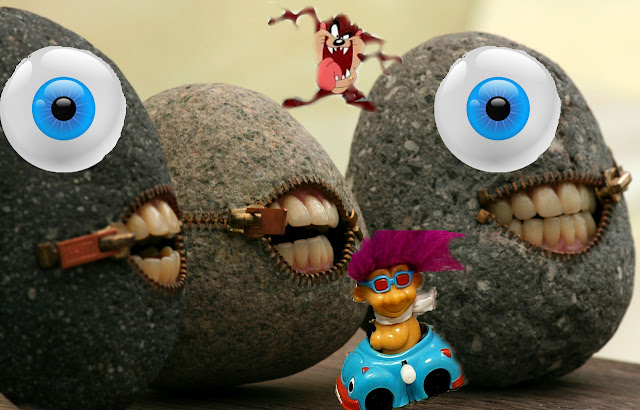
Inspired by Disney's movie A Toy Story, I have created a digital photography lesson plan in which students must create their own toy tale/adventure and turn it into a short video.  After spending some time writing our stories (contact me if you'd like the full lesson plan) we plan our photographs.  Each page of text (written like a children's story so one page is only a few sentences long) needs to have one photograph to go along with it.  The students have a box of random objects and toys I provide or they can supply their own toys.  They take the images they need and edit them to fit their story.  Some students superimpose multiple images together, and other students make due with what they have at hand. 

We type up our story and import all of our text and images into Windows Movie Maker.  The students really enjoy this program and it's exciting for them to see how they can transform still images into a video.  I teach the students how to time each slide, how to add various effects and transitions as well as how to incorporate music using clipping and fading.  I never get tired of watching their finished movies!  They are so unique and strange in the best kind of way! 

Finished examples:


These are the guidelines I give my students:

A Toy Story

Telling a Story Through Photographs

You are going to write a 12-15 page story about a toy that has come to life and had its own adventure/day out.  For each page that you write you will also have to stage a scene and photograph it to go along with the text (If you wrote 12 pages, you will take 12 photographs.  If you wrote 15 pages, you will take 15 photographs).  The “pages” are not full page word documents.  It can simply be one or two sentences that describe what is going on.  This is similar to a children’s picture book, there is not a lot of text, but it gives us just enough information to understand what is happening.  However, you will be using the parts of a story to demonstrate understanding through the use of a beginning, middle and an end.

First, you will write your short story (have fun with it and make it interesting).  You will then be given a toy (you are responsible for these toys and must return them in their original condition) or you can use/provide your own toys to be used in this project.  You can use class time to take photographs or do them on your own.  You may use any editing tools to enhance your images, including altering them as we did with our Surrealism assignment.  Your job is to create a series of scenes in which the toys have become a part of everyday life.  If you have seen the movie Toy Story, then it’s just as though the toys have come alive and are roaming around amongst us.  You will stage them in an interesting manner and take a series of digital photographs to document their adventure.  You may edit your image(s) with www.Pixlr.com/editor if you would like.  Be sure to pay close attention to your angles with this kind of photography.  Have fun!  Be Creative!

We will turn your images and text into a PowerPoint Presentation which we will then convert into a movie using Windows Movie Maker.  These steps will described and taught to you as you continue the assignment.

Monday, December 17, 2012

Writing Practice for Toy Story in Windows Movie Maker

Writing Practice

Creative Writing and Photography to Tell a Story in Windows Movie Maker

Art classes truly are cross curricular in every sense, whether the students realize it or not.  In all of my classes I like to incorporate some sort of writing; often times it is a critique, an artist statement or a short story to go along with a piece of artwork.  In my digital photography course, I teach the 8th graders how to transform a creative writing piece into their very own movie.

We begin by discussing plot, something they have already learned in their English class.  We focus on the need for a beginning, rising action, a climax, falling action and a resolution.  I explain the remaining criteria for their story and how it will be made (setting up and photographing toys in real life settings or superimposing a series of images together-as long as they photograph at least part of the image used for each scene). 

For practice, I show them a series of photographs taken by various photographers (websites provided for each photographer linked under each image) and ask that, as a class, they come up with sentences that would go with the image and where it would take place in the story (either beginning, middle or end).  Below are some of their examples, they are so creative!

 Image ‘Sasquatch Attack’ by Brian McCarty

Middle: Sasquatch Joe sought revenge on Susie for dressing him like a girl all of those years.
 

Image by Brian McCarty

Middle: Trina unleashed her road rage on the innocent bystanders.
 

Image ‘Cammy and Guile’ by Zelevol

Beginning: G.I. Joe and G.I. Jane arrive at the airport; ready to take their honeymoon trip to Hawaii, Canada.

Middle: They just got back from their honeymoon and were mugged.  They walked home sadly.

End: Feeling victorious, they walked home with pride in their hearts after defeating the evil Pigbutt.

Alternative Ending: Barry and Luanne lived happily ever after.
 

Image ‘Oh Noes’ by Chris McVeigh
 
Middle: The chipmunk ate Steve’s friend, Gerald! Steve declared war on all chipmunks and poisoned their almonds!

 
Image ‘GTA III’ by Brian McCarty
 
Middle: Jake was called in for reinforcements to help his friends involved in a catfight.


Image ‘Cheez-It’ by Brian McCarty
 
Middle: Toby got in trouble with Mr. Squeakers for eating his CHEEZ-ITs.

End: Billy Bob Joe finally made his way through the epic maze with Mr. Squeakers and claimed their prize!  YUM!

Saturday, December 8, 2012

Andy Warhol Inspired Portraits

Pop Art Portraits

Andy Warhol Inspired Photo Transfers

Photo Transfer Pop Art Portrait
My Finished Portrait
My students took a look at Pop Art and focused on Andy Warhol recently.  I'm using this as an opportunity to introduce them to new techniques other than just drawing, painting, clay and the mixed media sculpture that they are used to.  I am teaching them a photography transfer process.  This project is also great for students who need a confidence boost because it is based on and incorporates a photograph so they aren't as hard on themselves about the finished result. 

We started by looking at a PowerPoint I've created about Pop Art and Andy Warhol.  We discussed the characteristics of his artwork (focusing on portraits).  Since we just finished paint mixing, after awhile I began to focus the discussion on colors he liked to work with and pair together and was able to have a good conversation with the students about contrast and types of colors (tints, shades, primary, secondary, intermediate, etc).  Then the fun began!

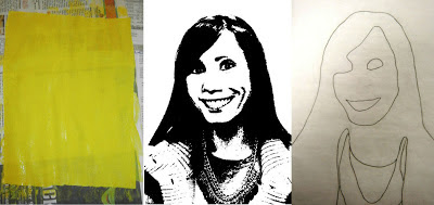
We started by taking photos.  I had each student stand infront of my white projector screen one at a time and pose however they wished.  Some students smiled, some made faces and others prefered their very own mug shot!  In my spare time, I posterized their photos using www.pixlr.com/editor and printed them as 8x10 images (on plain printer paper).  Below is the example of me and the first 3 steps:
How to Make Pop Art Portraits

The students each got an 8x10 sheet of fabric and painted it a color of their choice.  This would be their background.  While the paint dried, they took their 8x10 photo of themselves and a sheet of tracing paper to trace the basic shapes of their face and/or clothing. I urged them to press hard with their pencil and only trace major shapes that they would like to paint a second color.  I also encouraged them to trace shapes that they would want to match the same color as their background.  Every now and again a few students find this step confusing, I reassure them that there is not a right nor wrong way to do it and in the end, they all do a great job!

When the paintings were dry, we layed the tracing paper face down (pencil side down) onto the fabric and re-traced their tracing, but from the back side of the paper.  The students were amazed to find that this pressed their pencil from one side of the tracing paper onto their fabric.  I reassured them that their portrait should look "backwards."  We took our pencils directly onto the fabric to make the outlines stand out more.
How to Make Pop Portraits Tracing with Contrasting Color and Accents with Gloss Gel Image Transfer

The students used their new outlines to paint their second color.  I requested that they use a color that would be considered fairly high contrast to their first color.  As the paintings dried, we trimmed away the extra paper on our photographs. 

When they were dry, we covered our fabric with gloss gel medium.  To spare my brushes I had the students spread the gel over their entire sheet of fabric using their finger.  For the squeamish, I offered disposable gloves.  We then pressed our photo directly (and firmly) into the gel and allowed them to dry.

We used sponges and water to go directly over our paper so that it would begin to peel away.  After removing all of the remaining pulp, we had our image transfer and pop portraits!

Friday, December 7, 2012

Surrealism

Surrealism with Digital Photography

Students Use Photo Editing Skills to Create a Surreal Image

I'm teaching my digital photography students some new techniques to photo editing and focusing on how to superimpose one image into another.  I've also taken this as an opportunity for them to show me their weird side and introduce them to Surrealism.  I've asked that they create a surreal image by superimposing a minimum of four images together (they had to take a minimum of one of the photographs and the others could be "found").  I offered a box of toys and random props to use to their own personal photography contribution in the assignment.  The results are beyond hilarious!  I absolutely love how funny they are and much fun the kids had while they made them!  I highly recommend this lesson! 

Here are a few of their surreal images they've created.  I am only posting the ones without their faces in them.  

Superimposing digital images together to create a surreal image

Unfortunately I cannot site where my students got the images they put together. They were to be photographer of at least one of the photos used but the others could be found online. I did not have them site where they got the images from, only that they submit an original copy of the image to me digitally. In the future, I would ask them to site the found photographs so I could give credit where credit is due.

Superimposing digital images together to create a surreal image

Wednesday, November 28, 2012

Critiques

Writing a Critique

Students Learn How to Critique their Photography

Critiquing one's artwork is important for reflection and for growth as an artist.  I always like to take some time with my students to discuss what they think they were most successful with, why and what they struggled with and how they got through the struggle.  I also ask that they think about what they would change if they were to go back and redo or fix part (or all) of their artwork.

In my digital photography course, the students are experimenting with composition and trying to find their photographic voice.  For their first critique, I asked them to read an example of my own based on this article I found online by Haje Jan Kamps.  We discussed the purpose of writing critiques and I sent them on their way. 

After discussion and my example, this is what I give them to get them started.  Each student can then upload their own photo and reflect on what they have done:

Read the article provided about how to critique a photo. 

Now it is your turn.  Insert one of your photos  that you would like to critique.  Complete the following sentences and elaborate on them to create paragraphs (a minimum of 3-4 sentences each).

DELETE THIS BOLD/CAPS TEXT AND INSERT PHOTO HERE! 

When I look at this photo, it makes me think of…
Technically I think this photo is…
What I like about this photo is….
If I were to improve or change anything I would…


This is one of my student's finished photography critiques (along with her fabulous photo!).  It is short and sweet but it shows that she has thought about her work and she knows and understands the processes she has gone through to be successful.
Writing a Photo Critique Art Lesson
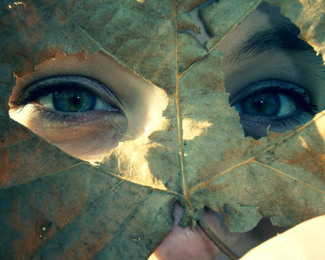
When I look at this photo, it makes me think of a fantasy movie with fairies and magic. The sparkles on her eye shadow remind me of sparkles on fairies wings, and the magic part of it. I like the colors of it because they are exciting.

Technically I think this photo is a good example of using frames, because the leaf holes are framing her eyes.  It also demonstrates how to fill the frame interestingly. I like it because it was a natural frame, and all we did was punch out holes for the eyes to create this mask.

What I like about this photo is the light. I like the way the light is dark, then bright. I also like how the leaf color matches the dots of brown in her eyes too.

If I were to improve or change anything I would want to make the leaf blurry and her eyes in focus.  I would not want it to be completely blurry, just enough that the eyes really popped out.  I could also go in and edit the color of her eyes so they would stand out and leave the leaf as it is.

Tuesday, November 20, 2012

Color Mixing Bingo

Color Mixing Bingo

Students Learn Color Mixing While Making a Bingo Card

My 6th graders are about to start an Andy Warhol inspired Pop Art Portrait in which they will be painting with bold, high contrast colors.  However, this is our first painting project of the year and I want to review a few painting basics.
I also think it is important for kids to understand color.  Naturally, they need to understand the color wheel but also the various types of color and how each color can be created.  So in honor of that need, I have created Color Mixing Bingo.  I have created 20 different Color (bingo) Cards like the following (Contact me if you'd like a copy of the Word document I have them saved in):
C
O
L
O
R
Purple
Blue
Pink
Yellow-Green
Red
Red-Orange
Maroon
Yellow
Light Blue
Green
Red-Violet
Blue-Green
FREE CHOICE-mix any colors you would like and see what you create
Orange
Light Purple
Brown
Yellow-Orange
Light Green
Blue-Violet
Gray
Ivory/Off White
Navy Blue
Black
Dark/Forest Green
Golden Yellow
On each card you will find the Primary, Secondary, Intermediate/Tertiary, Neutral and select Tints and Shades.  Each card has the same words, only they are in different locations.  Each student gets their own card and after discussing color mixing, we begin adding color to each box.  You can do this a couple of ways
 1)You can draw a color from a bowl (Bingo Style) and have each student find that color on their card and paint and/or mix paint in that box.  You can play Color Bingo as you go, when you have 5 in a row, you win a prize. 
OR
2) You can draw a color from a bowl (Bingo Style) and have each student find that color on their card and paint and/or mix paint in that box.  And just use this as an opportunity to go over how to make each color and not play Bingo rules just yet
OR
3) Set the students free to paint their own Color Bingo card at their own pace and leisure
When the cards are dry, we play Color Bingo and I give out small prizes if the student who wins can tell me how to make each of the colors they have in a row.


Color Mixing Bingo Card as made by a student

Friday, November 16, 2012

More Egyptian Mixed Media

Egyptian Mixed Media Continued...

More Student Examples of Egyptian Symbol Mixed Media

It's always so difficult for me to only post one or two photos of the kids' artwork.  These sculptures were so fun and unique, I wanted to share a few more with you.  I hope this inspires some creativity in your classroom or students' artmaking!

Various Egyptian Symbols made by Students with Mixed Media
Pictured above: The Egyptian God Bes, a Crocodile of the Nile, and a Crook and Flail

Various Egyptian Symbols made by Students with Mixed Media

Pictured above: Scarab Beetle, Anubis the Jackyl Headed God and an Aten

Thursday, November 15, 2012

Mixed Media Egyptian Symbols

Mixed Media Egyptian Symbols

Students Explore Mixed Media Sculpture Forms with Egyptian Symbolism

After finishing our mummies, I wanted the students to continue on with making their own decisions in their artwork while enlisting their creativity and problem solving abilities.  To continue our Egyptian studies, we looked at Ancient Egyptian Symbolism.  We discussed what "symbolism" means and how/where we find symbolism all over the world.  I presented them with some of the more commonly known Egyptian symbols and we discussed their meanings and uses.  I distributed a sheet of Egyptian symbols to the students and let them pick which one they would like to work with for this particular lesson.
Various Egyptian Symbols made by Students with Mixed Media
Above you will find an Egyptian Cat, a Djed Pillar and a Scarab Beetle

I introduced the students to the concept of medium and media as new vocabulary words.  I then took them on to discuss mixed media sculptures and how to consider different dimensions, sides and angles of their art can been seen.  The students rummaged through my boxes of mixed media (boxes filled with various donated items such as bottle caps, buttons, old jewelry, fabrics, pipe cleaners, cardboard, etc) and came up with their own plans.  They sketched out their symbol and labeled what each part of it would be made out of.  We then assembled them and got amazing results!
Various Egyptian Symbols made by Students with Mixed Media
Above you see Ibis, an Ankh and a Shen
 

Thursday, October 25, 2012

Ancient Egyptian Mummy Tales

Mummy Tales

Students Write a Biography to go with their Mummy Form

After the Sixth Graders accessorized their mummies, they wrote short stories about them.  Their basic requirement was to give a brief bio describing who the mummy was, what they were interested in and how they died (all while making sense with their accessorized mummy) as they incorporate an Egyptian reference or two.  I am constantly wowed by what they come up with, such creative minds!
Egyptian Mummy Art Lesson Plan with Writing
This particular mummy is accesorized with a monocle, bow tie and cane so his story was about being young and wealthy before dying at the clutches of a crocodile in the Nile River.

Here is another one of my favorites.  Her story was about Mummy Jordan (a bandage filled homage to Michael Jordan).  She even made a free standing basketball hoop and a ball out of a pom pom!
Egyptian Mummy Making Art Lesson Plan


Wednesday, October 24, 2012

Ancient Egyptian Mummies

Ancient Egyptian Mummies 

Students Create Mummy Forms with Modern Accessories

The Sixth Grade Social Studies teachers are currently covering Egypt and I jumped at the chance to introduce them to various Ancient Egyptian arts.  We started off discussing mummification and the steps and reasoning behind it.  The students loved taking this opportunity to share what they already know about mummies, tombs and Egypt in general (they especially like talking about how Egyptians removed a person's brain when they were to be mummified!).  We then set to make our own mummies with a modern twist.  We build foil body forms and wraped them in muslin that we cut into bandages and dyed various shades of brown with tea.  I got this idea from the Boise Art Museum where they had their own step by step process.  I used my own variation of this lesson, but the basic steps were the same. 
Egyptian Sculpture of Mummy Forms Art Lesson Plan

Step One: Build a Mummy Form from Tin Foil.  Some students used masking tape to hold parts together, others were able to use foil to hold form together

Step Two: (After cutting and tea-dyeing  the bandages) Wrap Mummy with various strips of fabric.  Add some school glue to the ends to keep wrap in place.

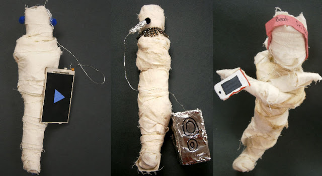
But as an art teacher, I couldn't just let our mummies all look the same tea-dyed brown, so for Step Three: we added personality to our mummies by creating accessories! Each student used mixed media to construct whatever accessories they felt necessary to make their mummy stand out. A lot of students made simple accessories like headphones and hats, and others constructed guitars and parachutes for their mummies. The creative juices were flowing and we had some great results. Here are a few of the finished mummies (these all happen to be musically themed, but there are quite a few other styles amongst the students). I'll be sure to post more photos as the kids finish up adding their details.

Mummy Sculpture Forms with Modern Accessories Art Lesson Plan

Tea Dye Troubleshooting: The mummies in the photos above are a lot lighter in color than the one pictured for "Step Two."  That is because I am new to tea dyeing and the class who made these mummies did not leave their bandages in the tea long enough.  I found that I needed to use many more tea bags to get the color right on this particular fabric and the bandages need to soak for a few days in order to really get that antique coloring.

Friday, October 12, 2012

Op Art

Optical Illusions

Students Make Op Art using Rulers, Compasses and Marker

I like to start my students off with projects that refresh them on basic motor skills as well as introducing them to the Elements and Principles of Art and Design.  Our current project focuses on the use of a ruler and a compass to give the illusion of depth and form through the use of space and perspective.  In short, we're creating our own Optical Illusions (or Op Art, if you will). 


We started off by talking about space and perspective and how you can tell if something is in the foreground, middleground or background in two-dimensional artwork. We talked mainly about size, shading and location of objects in the frame. Then we set to give our own illusion of form (something three-dimensional) through the use of sizing, spacing and varying angles and curve of line. We worked together to create a one point perspective drawing in a manner that we would still be able to achieve our Op Art style.  The students chose whether they wanted to color them in with marker or colored pencil and started by coloring their background (pictured above).  We then worked on coloring our "forms" or "globes/spheres" to keep with the illusion.  For a quickly drawn step by step tutorial of how we draw them, click here.
As you can see below, the result is mesmerizing!
Drawing Optical Illusions Lesson Plan

Friday, September 28, 2012

Bring On The Bow Ties!

Our school celebrates every Thursday as "Bow Tie Thursday" where students and staff alike are asked to come sporting a bow tie. Quite a few students and staff have been known to go all out with their attire and I couldn't help but notice a few particularly appealing duct tape bow ties! One student in particular has been fashioning them out of various duct tape prints (who knew there was such a variety of styles and colors of duct tape) and I was fortunate enough to recieve my first duct tape bow tie. She even chose a 'splatter paint' themed duct tape for me (I love it!). I can't wait to sport my new dapper, duct tape bow tie next Thursday! Try not to be too jealous...


Pretend this drawing dummy is me...wearing my bow tie...doing a heel click! Haha, enjoy!  I know I will!

Wednesday, September 19, 2012

Artsonia's Artist of the Week

Such great and exciting news!  One of my 6th graders has been selected by Artsonia.com as a contestand for the Artist of the Week!  See the email I recieved and link below to vote for Zach and his Cut Paper Symmetry! 

Dear Valerie,

 Great News!  Zach4528, from Ballard Middle School, has been selected as a finalist for this week's "Artist of the Week" award for the 4th-6th age group.  The finalist who receives the most online votes between now and Saturday September 22 will be selected as our "Artist of the Week." 

To view the finalists and cast your vote, simply click on the link below.  Voting is limited to one vote per computer per day for each age group!


The "Artist of the Week" will be featured on the Artsonia homepage and will receive a commemorative plaque from Artsonia.  In addition, Blick Art Materials has generously donated $100 gift certificates to the winning teachers and $50 to the winning artists.
 

All fan club members from Ballard Middle School have just been sent an email inviting them to vote, but we encourage you to personally spread the word at school, making sure all your students cast their votes right away!
 

Thank you for submitting your artwork to Artsonia and helping every child be an artist!

 
Sincerely,

Your friends at Artsonia

Zach's Nominated Artwork
 

Wednesday, September 12, 2012

Digital Photography Picture Taking Assignment

Tips and Tricks to Great Photography

Students enlist the Tips and Tricks in their own photography

My 7th and 8th grade Digital Photography class just completed their first picture taking assignments!  After spending time on editing, composition and camera handling, I finally let them loose!  I armed my students with a camera, a photo log (chart to write down what they took pictures of, when and where) and took them down the road to a conveniently located park.  I asked that the students take photos for the following categories: Portrait, Landscape, Action, Abstract, Candid, Free Choice from a Unique Angle and a Macro Image.  I couldn't have been more pleased with their results!  So it's only natural that I post a few of my faves
Tips and Tricks to Great Digital Photography Art Lesson Plan Unique Angles Example


Tips and Tricks to Great Digital Photography Art Lesson Plan


 Tips and Tricks to Great Digital Photography Art Lesson Plan


Tips and Tricks to Great Digital Photography Art Lesson Plan Simplify Example


Tips and Tricks to Great Digital Photography Art Lesson Plan Leading Lines Example

Thursday, September 6, 2012

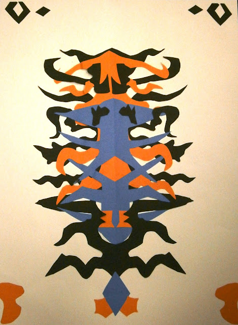
Cut Paper Symmetry

Cut Paper Symmetry

Students use Contrasting Colors to create a Symmetrical Design

I teach my students about the Elements of Art and Principles of Design through a series of lessons and projects which incorporate these key fundamentals.  I've started the 6th graders off with a project revolving around symmetry while incoporating line, balance (symmetry and asymmetry), shape and space (positive and negative as well as overlapping).  We discussed positive and negative space quite extensively during this project while focusing on making symmetrical shapes and creating symmetrical designs with the possibility for some asymmetrical touches. 

I love this lesson to start with because each student feels successful and strong in their artmaking through these simple tactics.  They have a lot of fun looking for shapes and figures within their cuts too!  My favorite so far is a student looking at the "bonus shapes" that I have as examples on my board (pictured below).  He told me "This black piece looks like a water buffalo and the two blue ones around the top of it look like lizards!"  I would have never seen the water buffalo and lizard trio!  They have such great imaginations, I love it!!!


 After students cut out all their shapes and have a good pile of "bonus shapes" I ask that they experiment with their layout before we glue antyhing. We review contrast, color distribution, how to use space and (of course) symmetry. They have a lot of fun coming up with their layouts and how they want things to overlap and sometimes weave together. They get really proud of their work (something I'm always eager to see!) and like to show off each idea to their classmates, it's a lot of fun to see how many different ideas they have.

Cut Paper Symmetry Art Lesson Plan with Color Contrast

When the students finished their work, I took a digital photo of each piece and uploaded it for parent access on Artsonia.com.  Check out our Cut Paper Symmetry Exhibit here

Friday, August 24, 2012

Digital Photo Editing

Digital Editing Skills

Students Learn and Practice Basic Editing Skills

I have the great benefit of teaching 7th and 8th graders a Digital Photography/Technology course.  I don't currently have the option of teaching them Photoshop because of the software provided so I have been focusing on teaching them how to use Microsoft Office and www.pixlr.com/editor.  The benefit to these programs is that many of them have Microsoft Office on their computers at home and pixlr is a free online editing program.  I found a great link to download Paint.net, another editing program, from and it also provided photos for the kids to practice on.  Follow this link to get them yourself: Photo Editing with Practice Images

Before we practiced editing, we talked about what makes a good photo.  This is my PowerPoint that I use to teach this Tips and Tricks PowerPoint

We have also been learning how to adjust red eye, brightness, contrast and other basic editing skills.  Here are some of the photos (from the site above) that the kids have cropping and one example of the cropped version:


The students are each assigned a computer and do their own editing.  I ask that after each assignment, they save and submit their work to me through our school's network drive.  They can just drag their work from their desktop to my "Hand In" folder in which they have each created their own subfolder named after themselves.  It is a great tool to have in a technology class, so the kids are becoming familiar with how to submit things through the computer system instead of printing hard copies of each assignment.  This is especially great for saving ink when we are just practicing simple skills like cropping and red eye removal!


Wednesday, August 22, 2012

Portfolios

Portfolios

Students create storage for their artwork

One of the courses I teach is a general 6th grade art exploratory.  I teach three sections of this on a three day rotation (I only see one 6th grade class each day) so after we got our syllabus, rules and beginning of the year activity out of the way I started the kids off with portfolios.  I think it is important for my students to have a place to store their artwork whether it is in progress or complete.  It helps keep them  organized (not to mention, my classroom organized too!)and it teaches them responsibility and ownership.  It their responsibility to come to class, find their portfolio and get out whatever we may be working on.  I also find it helpful to build the portfolio with them so that they get used to taking directions, watching demonstrations and working independently all in the same project.  I ask that their names be large and legible on their portfolios and that they create a decorative border.  They only have one class period to make and decorate their portfolio so it also teaches them to spend their time wisely.  Some students get further than others and so I always let them know if they finish another project early they can continute their design on the portfolio.
Student Made Paper Portfolios Art Lesson Plan

Thursday, August 16, 2012

New School, New Classes, New Students!

This is my sixth year teaching art and I just got a new classroom!  Lucky for me, I love change because this year there has been plenty of it!  I recently started my new job at Ballard Middle School in Huxley, Iowa and I believe it is going to be a wonderful year in my art room! I'm teaching  6th grade art and 7th and 8th grade Digital Photo/Technology and couldn't be more excited! 

To clear up any first day jitters I played a little game with my students (which I can't disclose here because it involves some mystery and I don't want my future students to already have the inside scoop!  But if your curiousity is killing you, message me and I'll fill you in!) and go over rules/expectations.  I also ask that my students fill out a brief survey so that I know where they are with experience and skill level to help guide my instruction throughout the year.  The kids have been great and I'm really looking forward to getting my nice, clean room filthy with art making!  Enjoy the clean room and empty shelf photos while they last because they won't last long!


Side note: Feel free to use any of my resources!