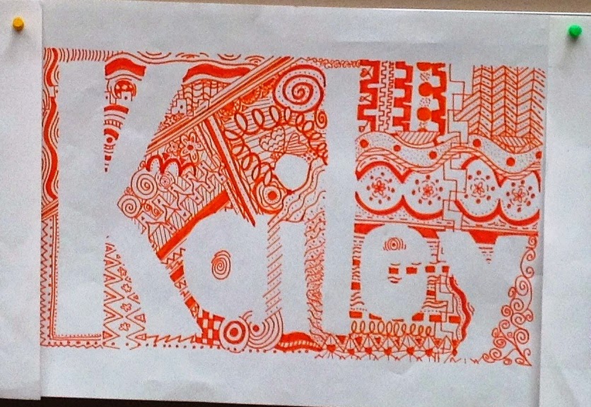
Zen that tangle
My school year is divided into trimesters and each trimester, I switch which level of middle school I teach. I recently (okay, it's been a few weeks now but I've been slacking on the blog) began the third trimester and am teaching eighth grade. I'm awful with names, so this project was perfect to start with so that I could work on that skill (learning their names) AND still have an art agenda!
Without much--or any--instruction, I started by having the students draw four patterns in their sketchbook, followed by four designs. Then I asked them to describe the difference between design and pattern. I also had them describe "variety" and how it can be used in design making. We looked at our sketchbooks and what we had drawn, then discussed what makes a good design/pattern and a bad design/pattern and how variety can play a role. We talked about variety in color, thin/thickness of a line, types of lines or shapes, direction/angle and anything else we could possibly come up with that you could vary in the process of art making. We also made a list (they were actually drawings) of different types of lines and shapes on the white board. Once we had a handle on those things, we moved on to talk about positive and negative space and what we would be doing with these various art words/techniques.
We started by drawing a 1.5" border around their paper (this was just an excuse to remind them how to hold and use a ruler to draw a straight edge as well as how to measure a border consistently instead of eyeballing it). I asked them to write their name in bubble or block letters inside of their frame and to make sure none of their letters were touching. I had them use their ruler to divide their framed area into six random sections. In each section I had them draw a different type of line (just to keep them on their toes about the variety aspect--they have to incorporate that random line into a design somehow, right?). I reminded them of what a Zentangle is and how they should keep adding details and eventually find that they are "lost in design." I also reminded them to maintain their letters as the negative space and to fill designs/patterns right up against and in between each letter.
I let them decide if they wanted to use one color or multiple colors and just encouraged those who chose multiple to keep an eye on even color distribution. At the end, I told them that they could use colored pencils to add some shading if they wanted some depth to a few areas of their zentangle, but unfortunately, many of them thought that they could just color in their background (which kind of defeated our designs forming the positive and negative space instead of an outline or coloring in of something). The variety came out great and many of them really grasped the concept of unity too! I love having our halls decorated with these beautiful name designs!
As I go to post these photos, I realize how blurry they are and crooked many of them are, I apologize...I need to stop using the iPad as a camera, I never take good photos with that thing!
.JPG)
.JPG)

.JPG)

.JPG)
.JPG)
.JPG)


No comments:
Post a Comment
Note: Only a member of this blog may post a comment.